Melbourne

We create brands that feel instinctively right and strategically precise

Sensemaking is how we work – turning intuition, research, and scattered ideas into brand systems that hold together, on shelf and in the mind.

Every brand starts as something felt before it’s something said.
Our process gives that feeling structure — without flattening it.

  1. Step 1

    Understand

    We begin by listening: to the brand, the market, and what hasn’t been said yet.

  2. Step 2

    Position

    Strategy, meaning, and a Big Idea that gives every future decision a reason.

  3. Step 3

    Shape

    Visual and verbal language that expresses the strategy, not just decorates it.

  4. Step 4

    Systemize

    Guidelines built to be used, not filed away — a system that can grow with the brand.

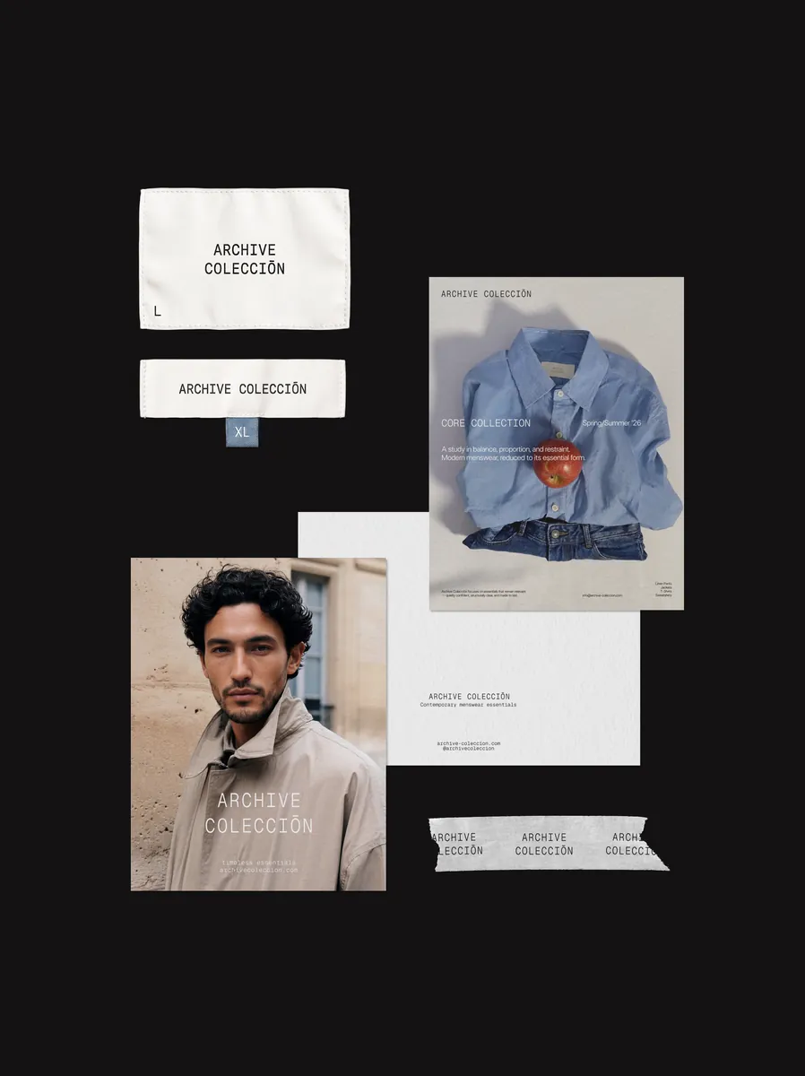
Round The Tree cider bottle in a moss-covered orchard at night Raw Canvas billboard on a city street Mareé jewelry campaign layout Lavender bath packaging on a tiled surface Website shown on a laptop in blue light Archive Colección print and business card mockups

Full brand systems, or the
one piece you need right now.

  • Brand Strategy

    Positioning, Big Idea, brand personality, and tone of voice – the thinking that everything else is built on.

  • Visual Identity

    Logo, typography, color, graphic system – a visual language built from a brand metaphor, not a template.

  • Communication Strategy

    The Big Idea, core message, tone of voice, and a channel-by-channel plan for how the brand should sound and show up.

  • Packaging Design

    Two design concepts grounded in category and shelf research, refined into print-ready files.

  • Web Design

    A landing page or multi-page site, designed and built no-code, with copy included.

  • Design Support

    An ongoing monthly retainer for recurring design needs – social content, presentations, print materials.

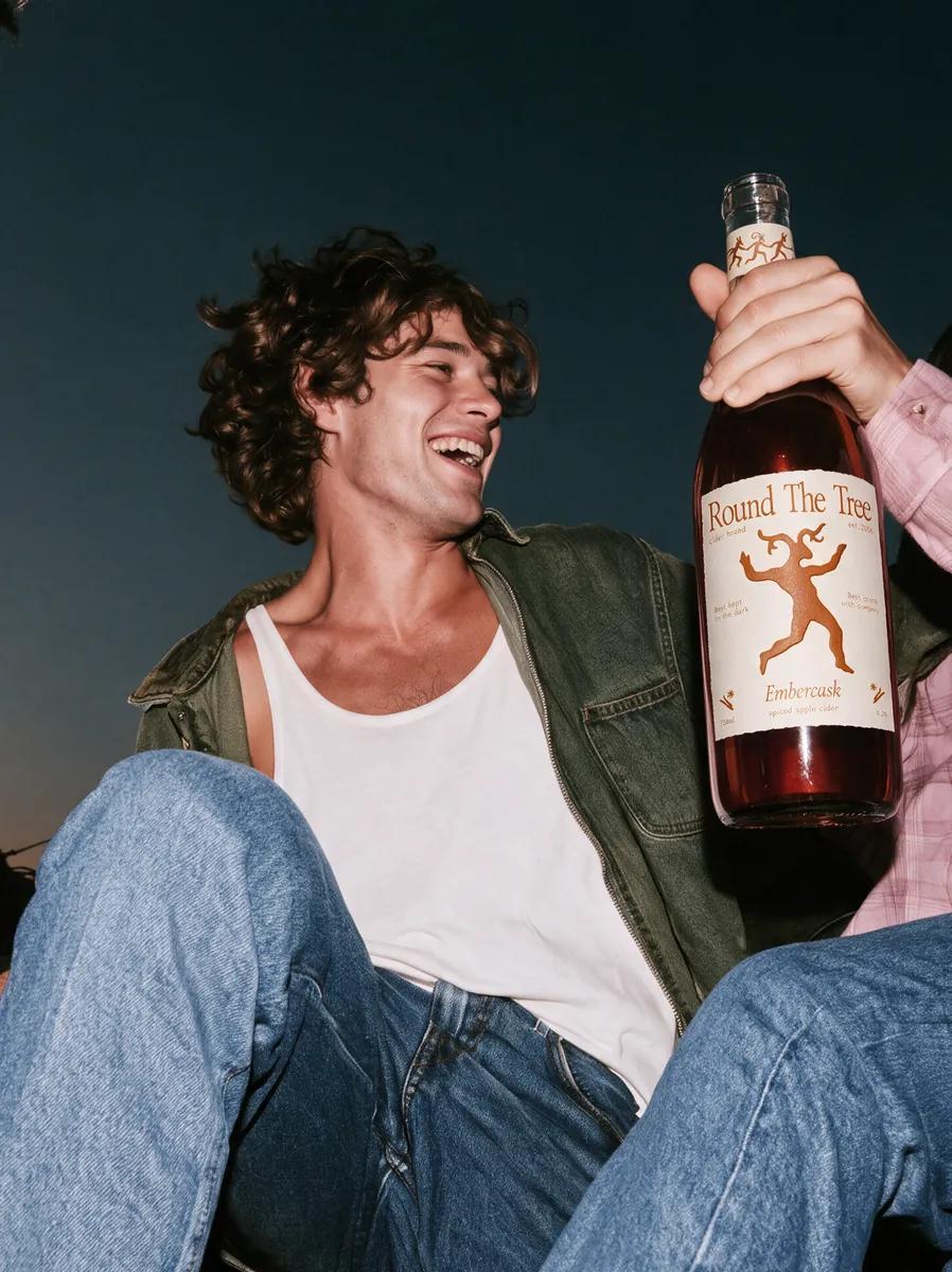
  • Man laughing with a bottle of Round The Tree cider
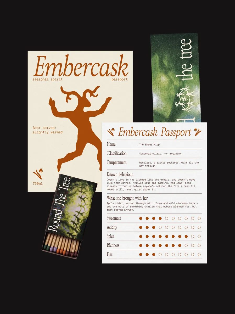
  • Embercask label and passport card
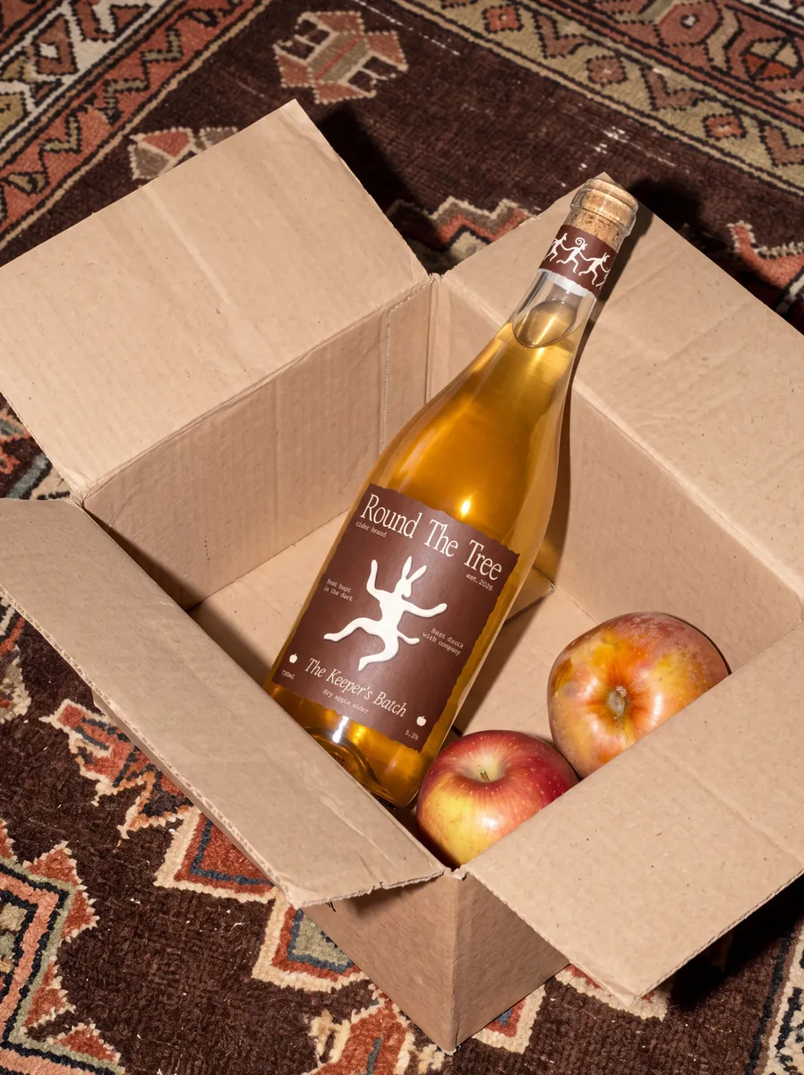
  • Cider bottle in a cardboard box with apples
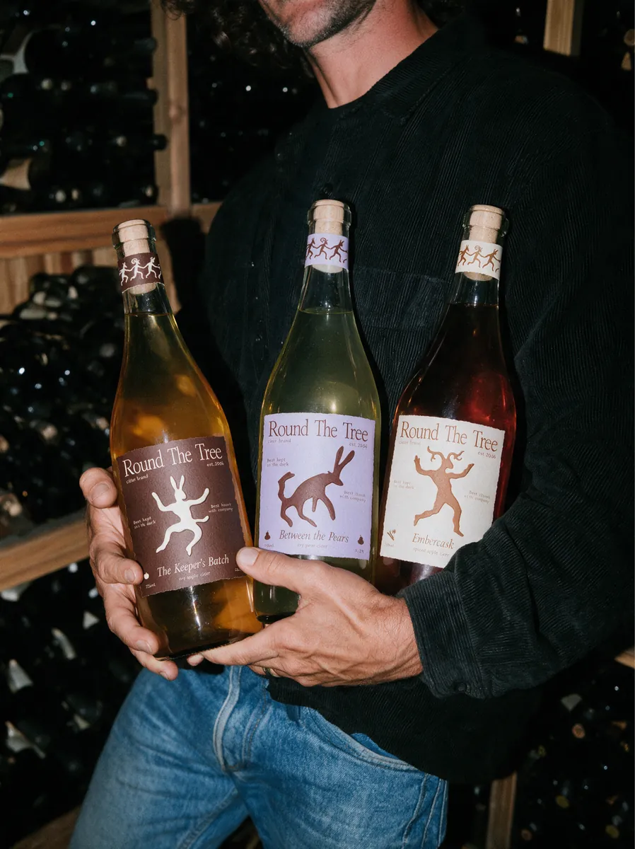
  • Three Round The Tree bottles in a cellar
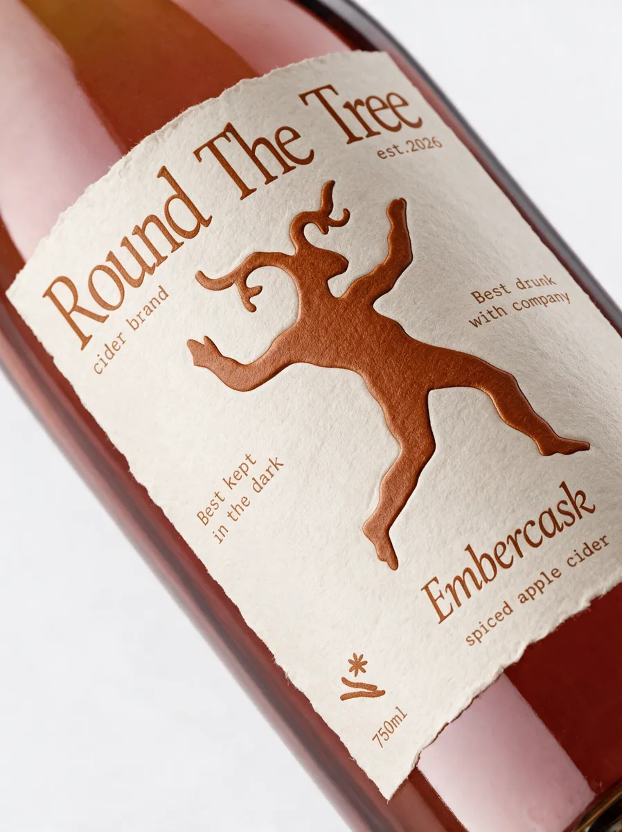
  • Close-up of the Embercask label
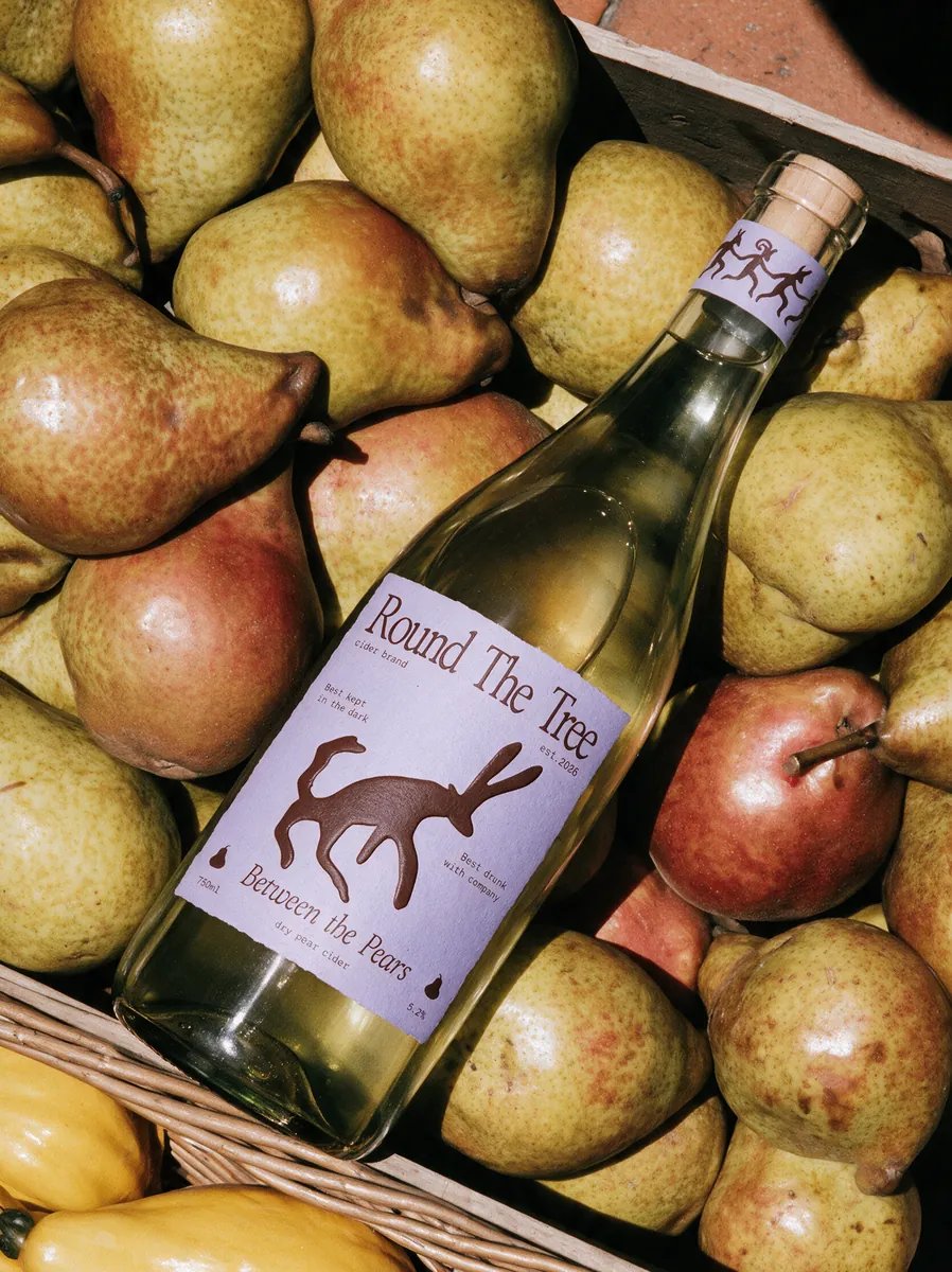
  • Cider bottle among pears
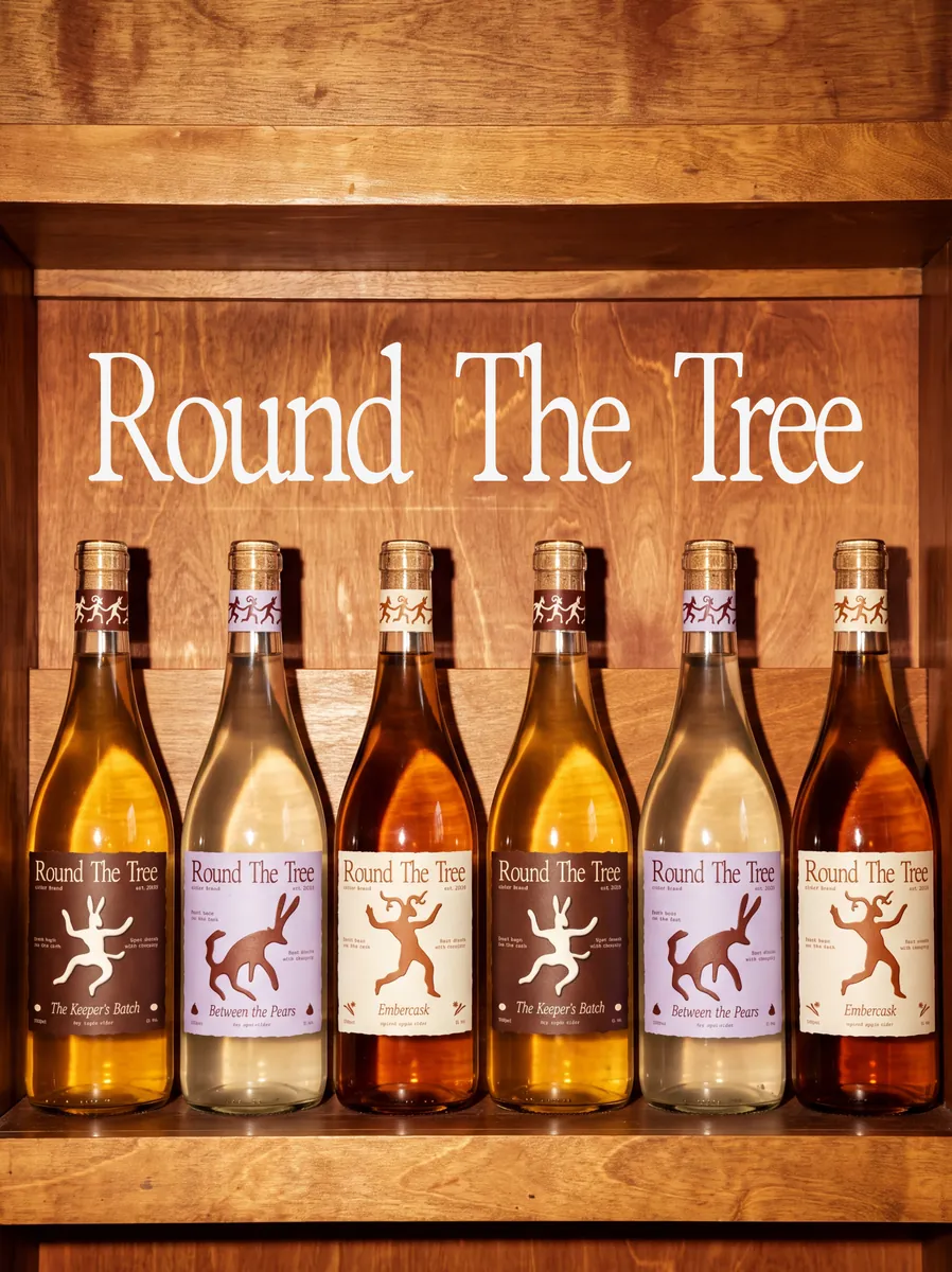
  • Round The Tree bottle line-up

Round The Tree

Brand platform
Brand identity
Packaging design
Art direction

A cider brand built on the idea that an untended orchard is never really empty. Where the category uses the orchard to signal control, we treated it as a living world of folklore, so every bottle becomes a piece of “bottled folklore.” Flat folk-art silhouettes, one colour story per flavour, and a ring-dance logo of orchard spirits that breaks apart into a character for each cider.

View full case →
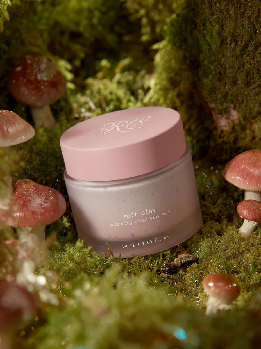
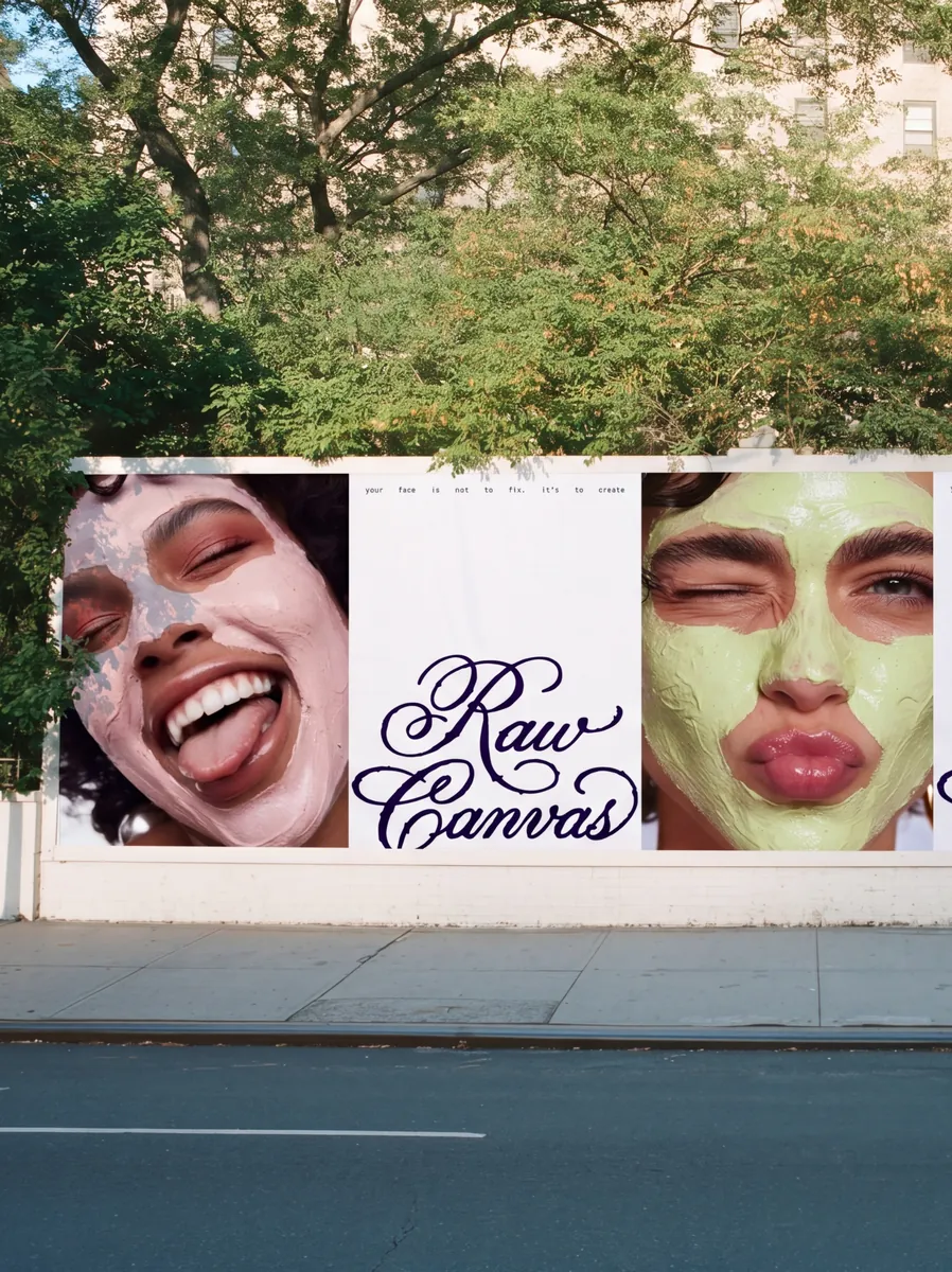
  • Raw Canvas jar among mushrooms and moss
  • Raw Canvas billboard on a city street
  • Raw Canvas jar and iridescent packaging
  • Raw Canvas sachets
  • Raw Canvas box on white tiles
  • Woman with a clay mask lying in a meadow
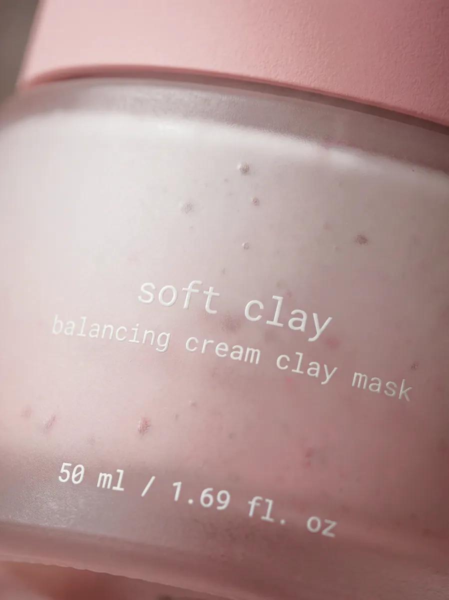
  • Close-up of the Soft Clay jar

Raw Canvas

Brand platform
Brand identity
Packaging design
Art direction

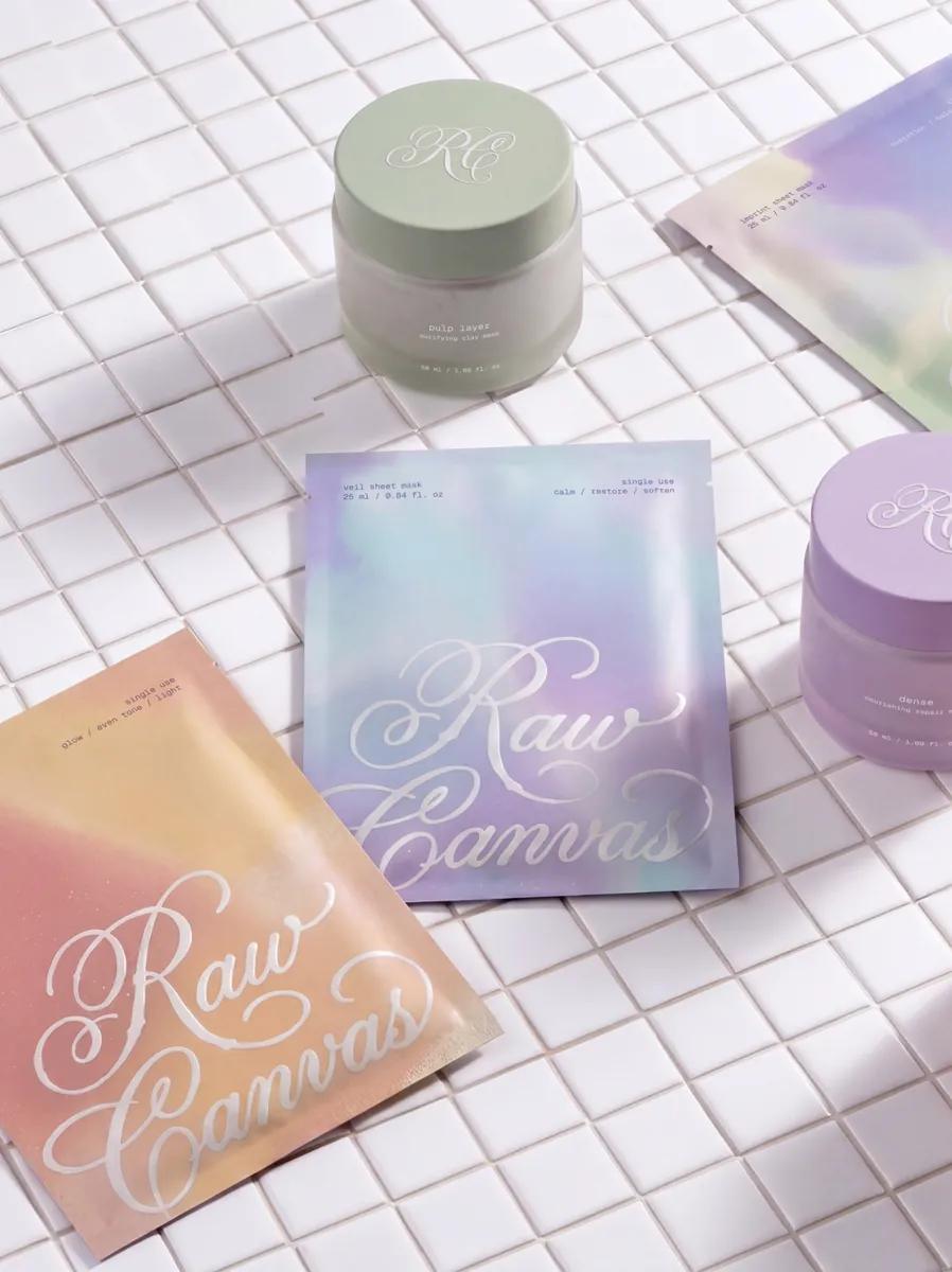
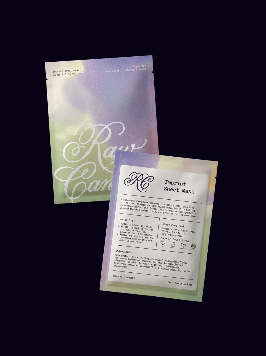
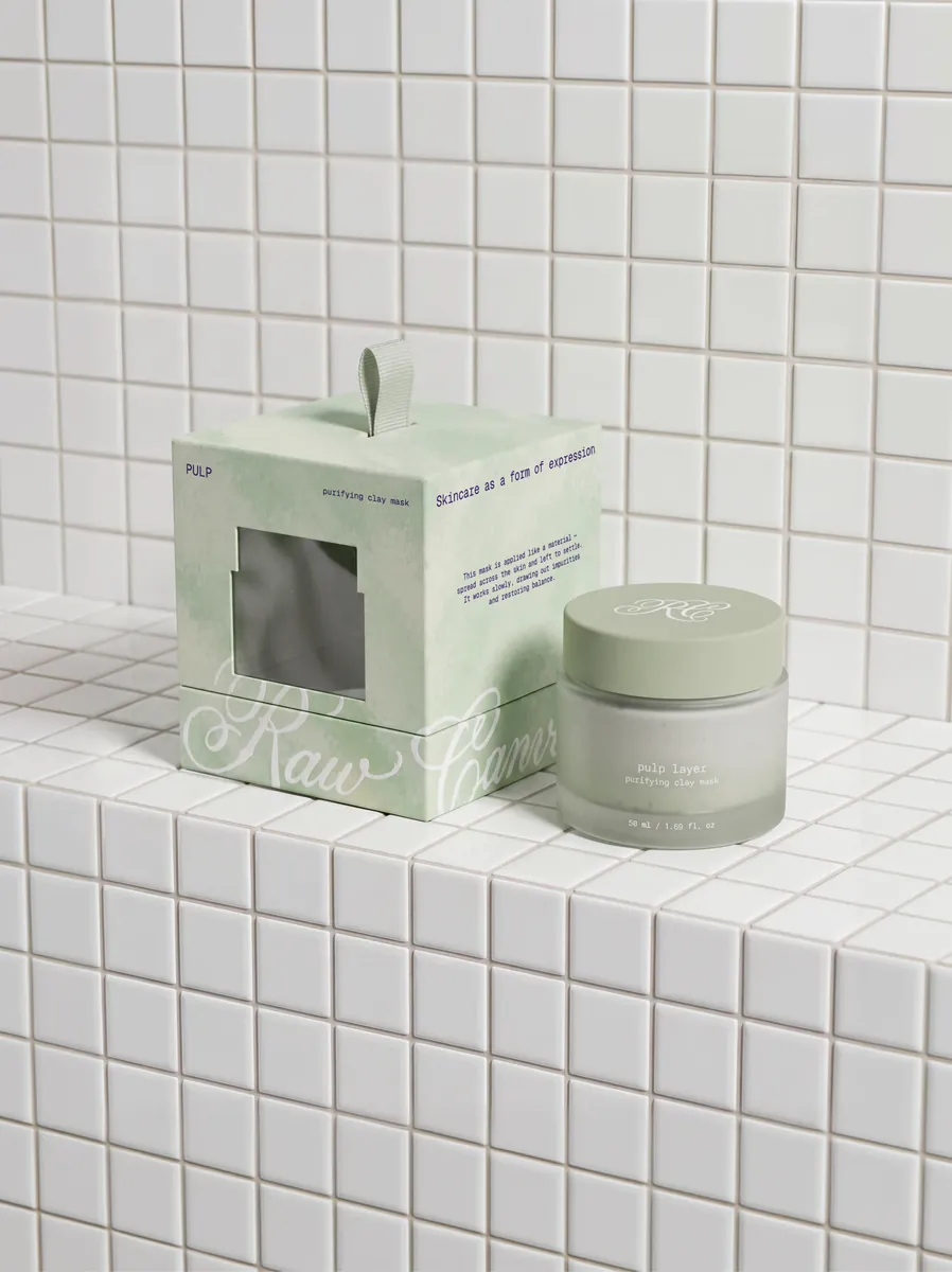
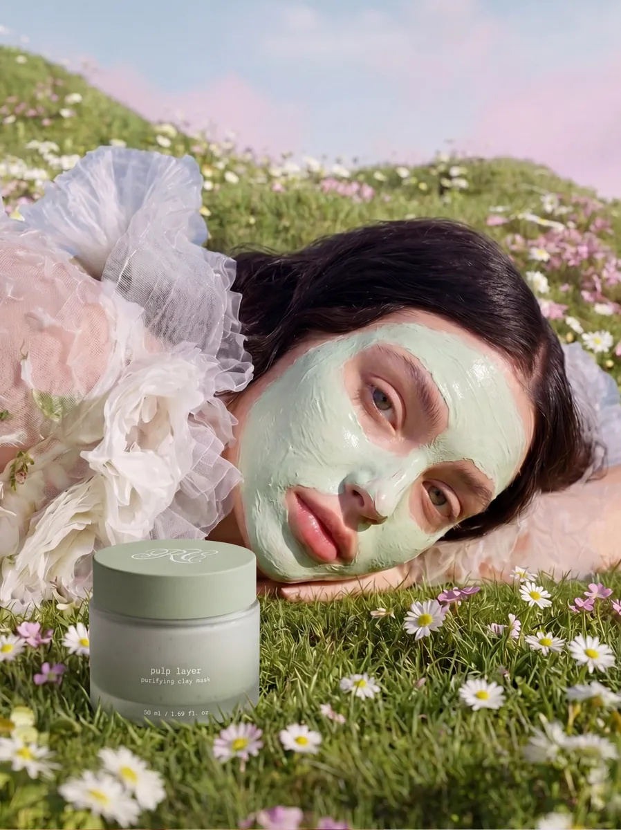
A skincare brand concept for a generation that sees beauty as individuality, not perfection. Inspired by painting, it reimagines skincare as layering, where the face becomes a surface and each product a soft, expressive layer. Dreamy pastel gradients, tactile packaging, and a signature-style brandmark.

View full case →
  • Archive Colección lookbook cover
  • Archive Colección stationery on a dark surface
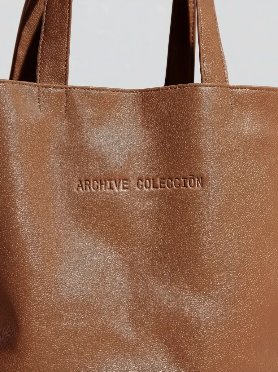
  • Leather tote with an embossed logo
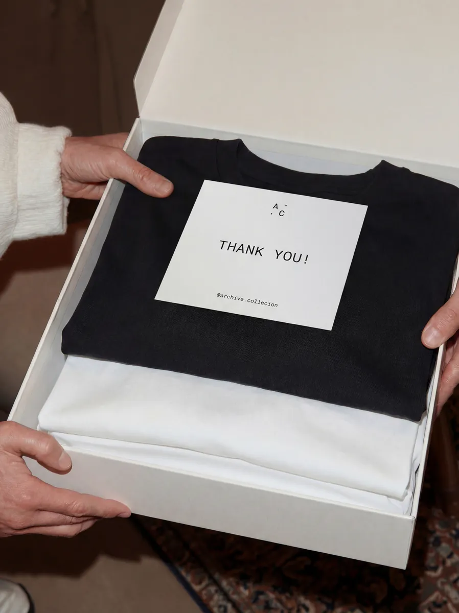
  • Gift box with a T-shirt
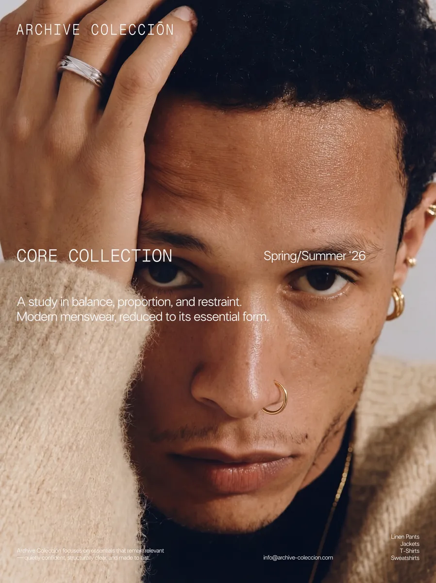
  • Editorial portrait for Archive Colección
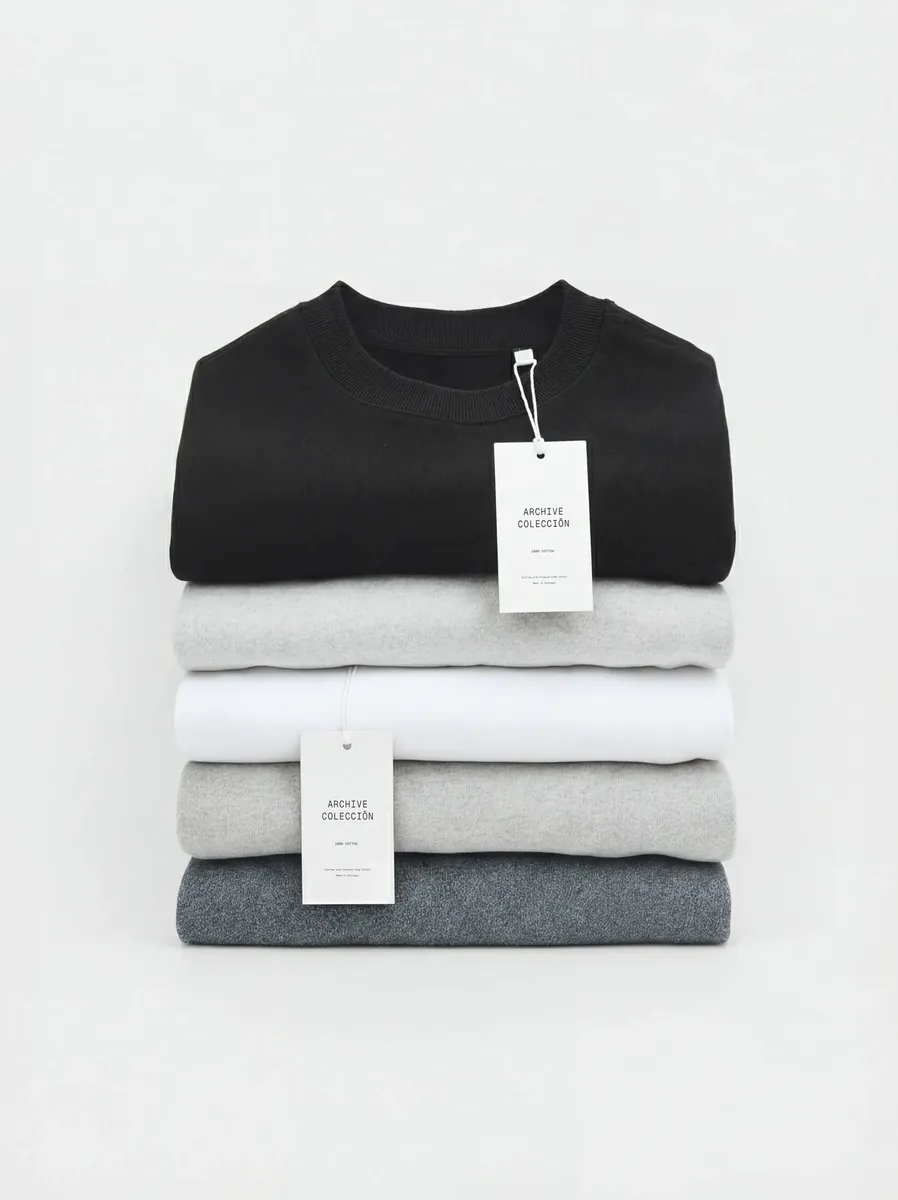
  • Folded knitwear with tags
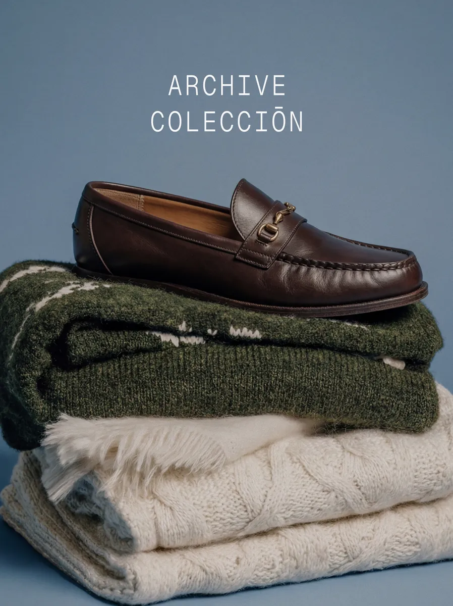
  • Loafers on folded knitwear
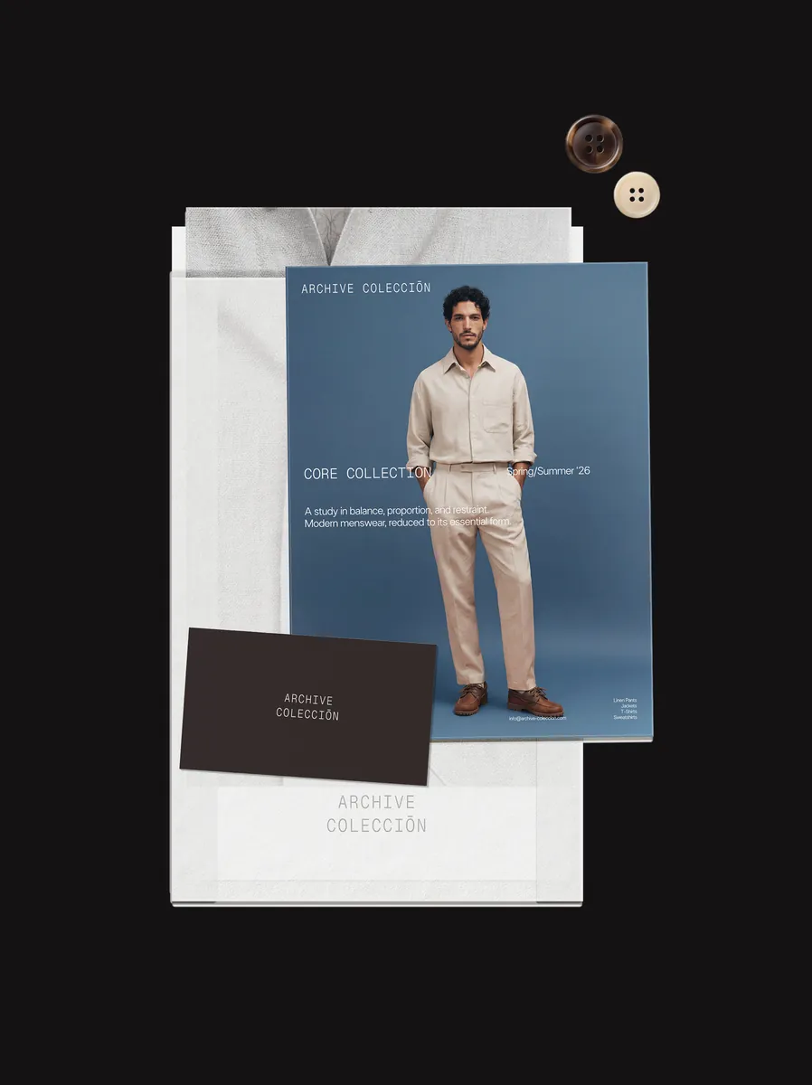
  • Archive Colección print and business card mockups

Archive Colección

Brand identity
Art direction

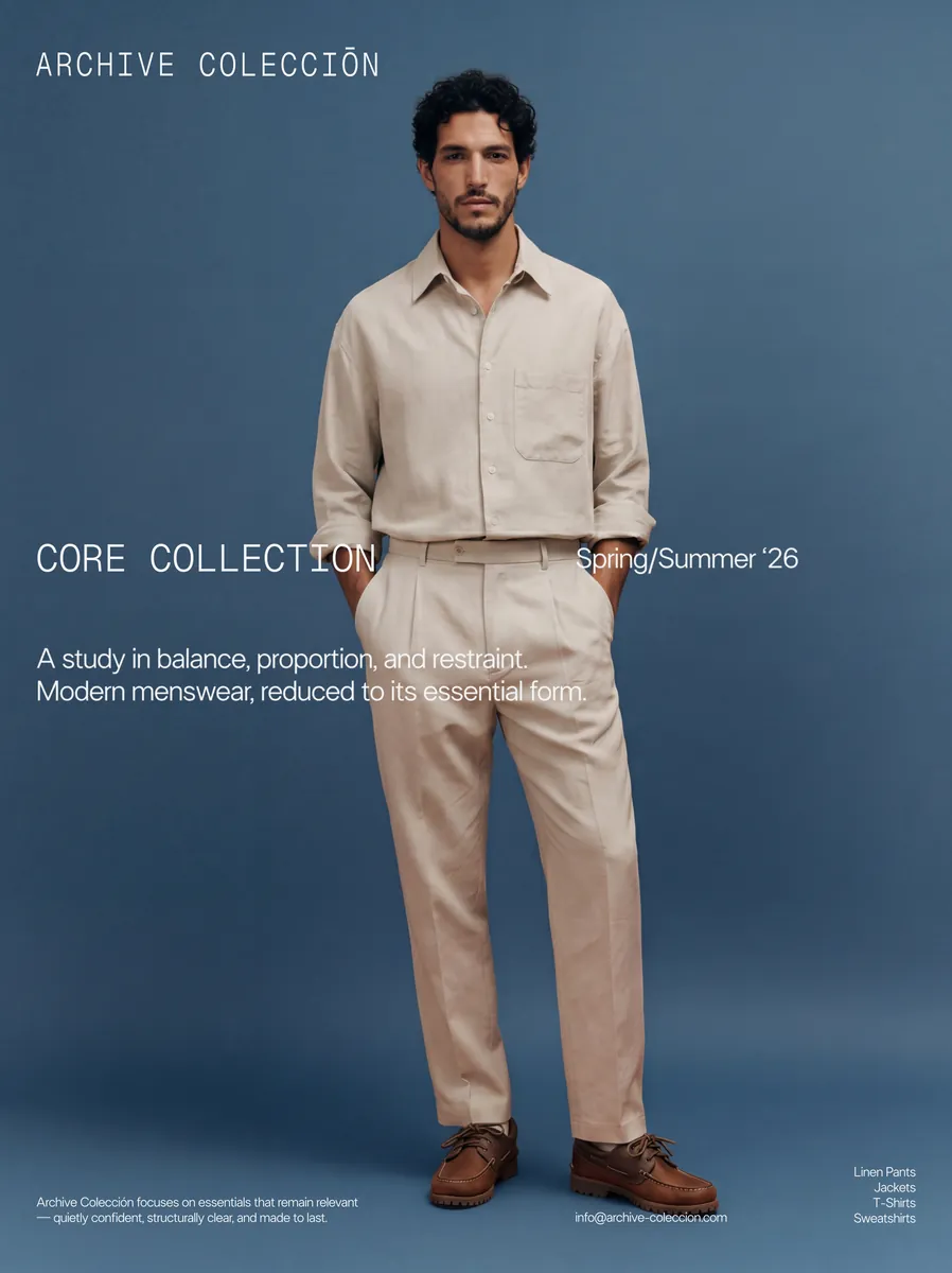
A contemporary premium menswear brand built on longevity: garments designed to stay relevant beyond the season. The identity is rooted in system thinking, where typography, spacing, and composition carry the meaning. A monospace logotype, neutral tones, and strict layout let the craftsmanship lead.

View full case →
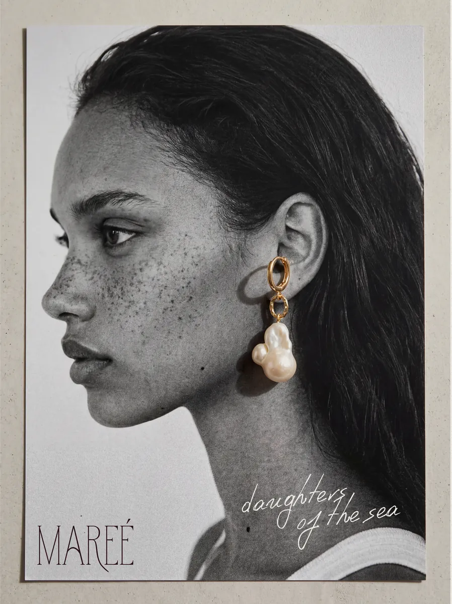
  • Mareé editorial portrait with pearl earring
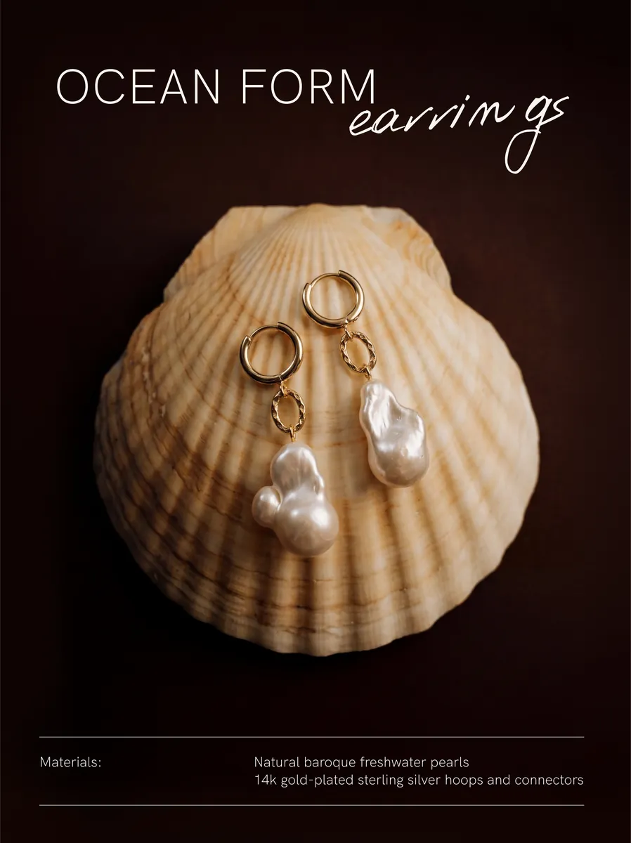
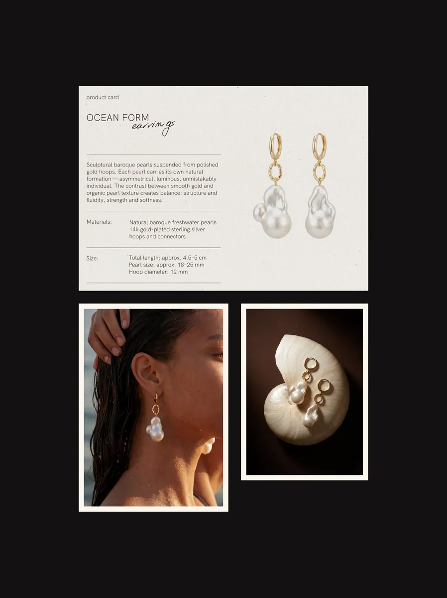
  • Ocean Form earrings on a shell
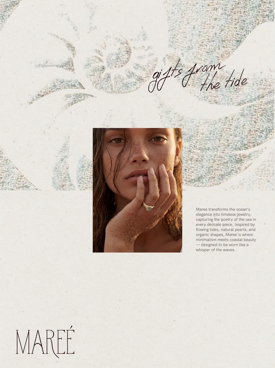
  • Mareé “gifts from the tide” layout
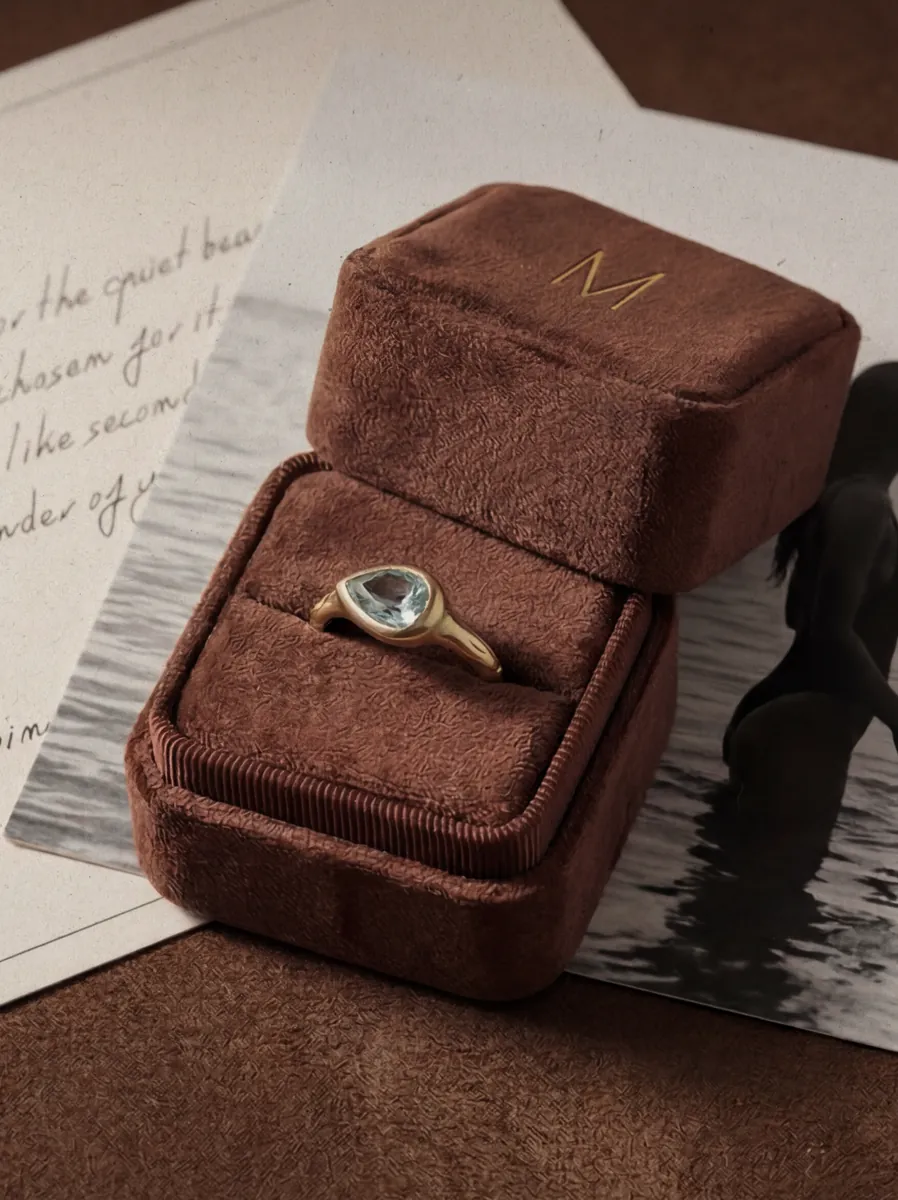
  • Ring in a velvet box
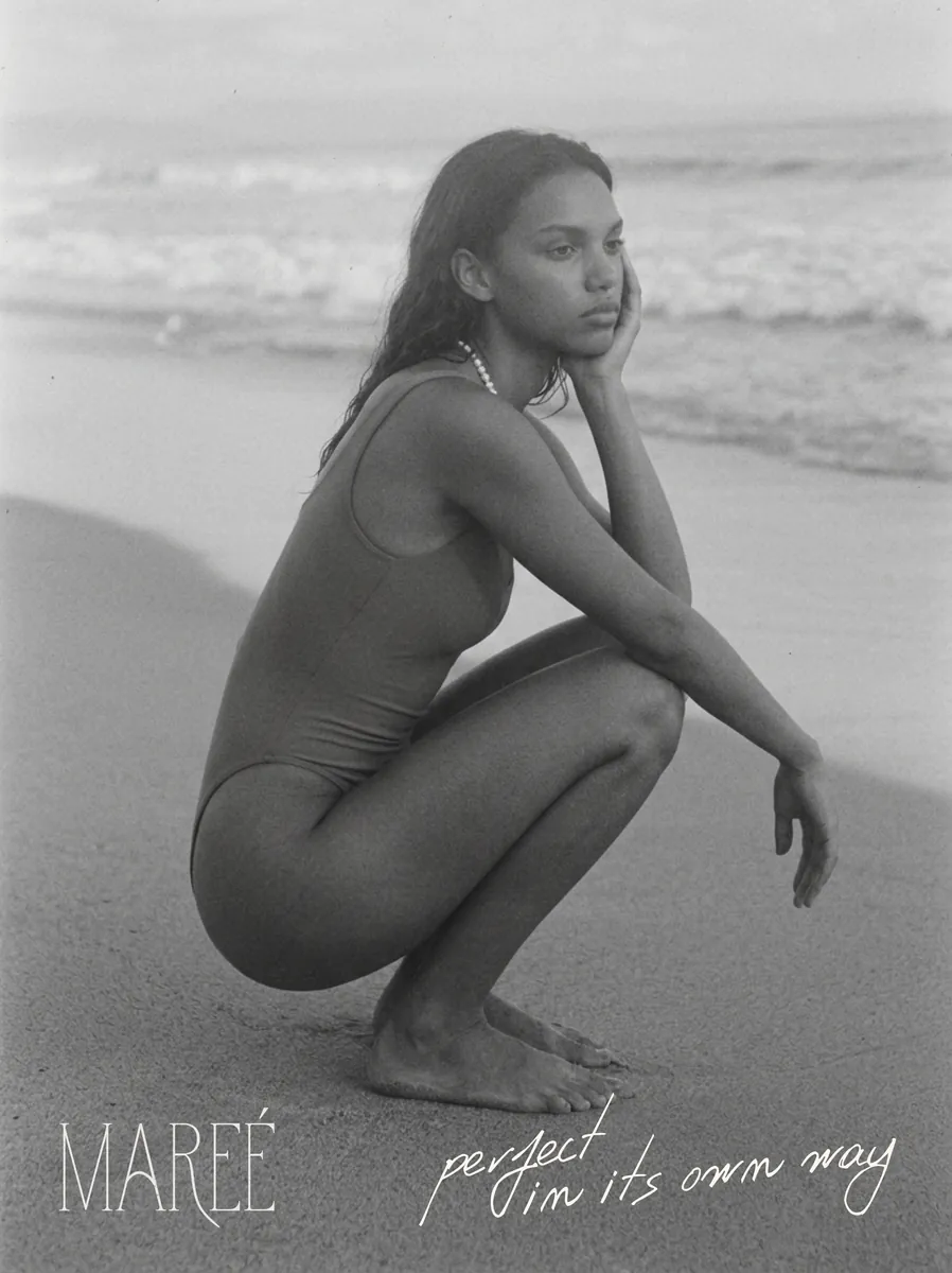
  • Black-and-white beach portrait
  • Mareé cards and photography on a dark background
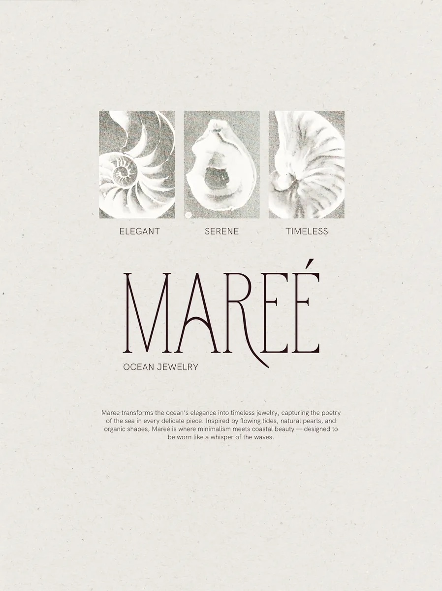
  • Mareé logotype with illustrated shells
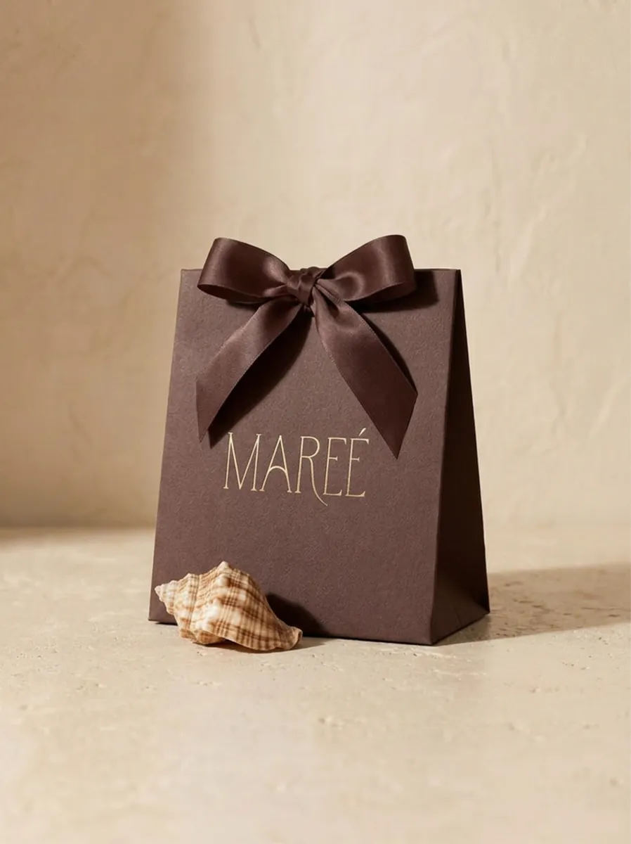
  • Mareé gift bag

Mareé

Brand platform
Brand identity
Art direction

A premium ocean-inspired jewelry brand built around pearls and organic forms. We embraced irregular shapes and understated elegance, positioning the jewelry as a subtle extension of the body, shaped by the rhythm of the tide. Refined typography, warm neutral tones, and tactile imagery.

View full case →

About

SNSMKNG

SNSMKNG is a boutique branding agency working at the intersection of strategy, emotion, and design

Each project is treated as a search for meaning: a dialogue between brand and audience, where design becomes a living system that tells a story, evokes emotion, and drives growth

Intelligent
design for
meaningful
brands

Intelligent design for meaningful brands

Have an idea
that needs form?

Fill out a short brief and tell us about your brand and what you’re looking for. We’ll review it and get back to you to talk through the project in detail.

Or you can contact us via email:
hello@snsmkng.com